
|
It had been a couple of years since I updated my list of favorite album covers. During that time the blog site I used underwent massive changes that made it much harder to use. After reading through it all, it was just easier to start over again. At some point in time I'll try to import the earlier postings. So here's to starting over. Ah album covers. Yes, I have bought albums simply for the stunning covers. Here's a sample of some covers that have recently caught my attention. Most are on the list because they were eye-catching. A couple are on the list because they are soooooooooo bad. Last updated: 20 JANUARY, 2024
|
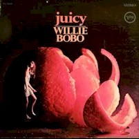 |
Grade: **** stars Artist: Bobo, Willie Title: Juicy LP Cover Concept: Acy R. Lehman LP Cover Photo: Rudy Legman Company: Verve Catalog: V-8685 Year: 1967 Country/State: US
|
At least for me, Willie Bobo's "Juicy' is
one of those album covers that epitmamizes the '60s "hip"
feeling. Pretty girl in a short skirt next to a delicious looking
piece of fruit. What kind of subliminal messaging is going on here
... The cover was designed by the late Acy R. Lehman. Lehman
served as a graphic designer and art director at numerous record labels,
including RCA and Verve Records/MGM Records.
I found a wonderful on-line obituary/memory toLehman - worth a quick read: LEHMAN, Acy Rudy (sfgate.com)
|
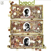 |
Grade: **** stars Artist: Bread Title: Bread LP Cover Concept: William S. Harvey LP Cover Design: Abe Gurvin Company: Elektra Catalog: EKS 75044 Year: 1969 Country/State: US
|
The late Abe Gurvin had a unique style.
Commercially he's best known for his advertising portfolio which included
sales campaigns for Coca-Cola, Disney, IBM, Kenwood, IBM, Marantz, Toyota,
Time-Life Books, Sony Music. He also designed 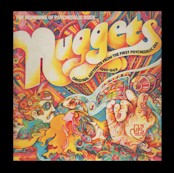 dozens
of album covers (both classic and rock LPs). He' probably best know
for designing the famed "Nuggets" compilation, but
there are lots of equally impressive efforts, including this one.
Bread has always been one of my guilty pleasures and their 1969 debut is a
great place to start exploring their catalog. The band name
supposedly came to David Gates when he found himself stuck in traffic
behind a Wonder Bread delivery truck. In this case Abe Gurvin's art
did a great job of linking the band name to the slang term -
"bread" = money. I smile every time I see it.
Gurvin passed on in 2012. dozens
of album covers (both classic and rock LPs). He' probably best know
for designing the famed "Nuggets" compilation, but
there are lots of equally impressive efforts, including this one.
Bread has always been one of my guilty pleasures and their 1969 debut is a
great place to start exploring their catalog. The band name
supposedly came to David Gates when he found himself stuck in traffic
behind a Wonder Bread delivery truck. In this case Abe Gurvin's art
did a great job of linking the band name to the slang term -
"bread" = money. I smile every time I see it.
Gurvin passed on in 2012.
The Peculiar Manicule website has a page dedicated to some of Gurvin's work and serves as a quick way to get a feel for his unique style: Abe Gurvin — The Peculiar Manicule
|
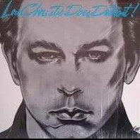 |
Grade: * star Artist: Lou Christie Title: Christie Does Detroit! LP Photograph: not applicable LP Cover Design: Shibui Company: 51 West Catalog: Q 16260 Year: 1982 Country/State: US
|
If only for the fact his amazing voice is
among my first musical memories, I have a soft spot in my heart for Lou
Christie. I don't know a lot about Christie, but by the early-'80s
he was on the oldies circuit where he scored an unexpected hit with a
Beach Boys medley credited to The Cantina Band. The resulting
publicity found the CBS associated 51 West label sign him to a contract
resulting in the release of "Christie Does Detroit!"
A throwaway collection of Motown classics, Christie's taste in tunes was
fine, but his performances added nothing to these ten tracks. Did
you really need another cover of 'My Girl'? As for the cover art -
well, if the intent was to make Christie look like a drugged psychopath,
then artist Shibui did a wonderful job.
|
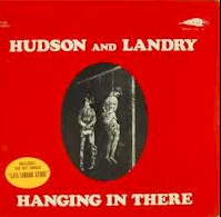 |
Grade: * star Artist: Hudson and Landry Title: Hanging In There LP Photograph: not listed LP Designer: not listed Company: Dore Catalog: LP 324 Year: 1971 Country/State: US
|
Bob Hudson and Bob Landry - pair of LA based DJs who recorded a series of early-'70s comedy albums. I can't imagine they were funny then and they sure aren't funny now. Hard to believe but their vignette "Ajax Liquor Store" was actually nominated for a Grammy Award. "Happy Hippy", references to Rudolph Hess and the canned audience laughter ... Horrible. Like the rest of the LP, the cover was beyond tasteless. |
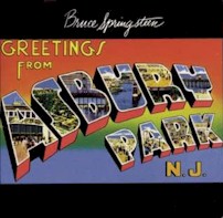 |
Grade: **** stars Artist: Bruce Springsteen Title: Greetings from Asbury Park LP Photograph: Technor Brothers LP Designer: John Berg Company: Columbia Catalog: JC 31903 Year: 1973 Country/State: US
|
Like
the boss himself, the late John Berg's "postcard" cover strikes
me as a classic slice of Americana. Maybe it's the fact the cover
brings back childhood memories of summer at the beach, but the cover will always reminded me of those
wonderful, carefree times. The postcard design itself is colorful,
eye catching and just a blast to stare are.
summer at the beach, but the cover will always reminded me of those
wonderful, carefree times. The postcard design itself is colorful,
eye catching and just a blast to stare are.
Prior to his death in October 2015, Berg had served as part of Columbia's creative department for over twenty years, including serving as the label's creative director. He had a role in over 5,000 album covers, including The Byrd's "Fifth Dimension", Dylan's "JOhn Wesling Hardy" and most of the Chicago covers.
|
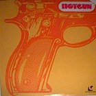 |
Grade: **** stars Artist: Hotgun Title: Hotgun LP Art Direction: not listed LP Designer: not listed Company: Guinness Catalog: GNS-36014 Year: 1977 Country/State: unknown
|
Wish I knew more about the cover, but as a release on the taxscam Guinness label there are no art work credits. About all I can tell you is that complete with bright colors, the Andy-Warhold-meets Roy Lichtenstein cover attracted my attention. |
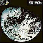 |
Grade: **** stars Artist: Sagittarius Title: The Blue Marble LP Art Direction: Lunar Graphics LP Designer: Kittyhawk Graphics Company: Together Catalog: STT-1002 Year: 1969 Country/State: Los Angeles, California
|
Earth photo covers are not unique, but this was just such a stunning picture of the planet (courtesy of NASA) that I felt it was worth adding to the list. The second Sagittarius album (Curt Boettcher and Gary Usher), it's not quite up to the debut but still worth a spin. |
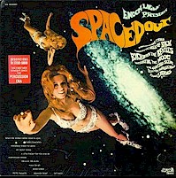 |
Grade: **** stars Artist: Enoch Light Title: Presents Spaced Out LP Art Direction: not listed LP Designer: not listed Company: Project 3 Catalog: PR 5043SD9 Year: 1969 Country/State: US
|
Ah,
a classic
time piece. Project 3's marketing department seems to have splurged
on this cover concept. What did a roll of tin foil cost back in
1969? $75 cents? How could you go wrong showcasing a
cute red head cloaked in a tin foil bikini and go-go boots. No
credits for artwork, or design concept, but there's a ton of information
on the instrumentation.
Anyhow,
I'm not sure anything else needs to be said about this cover. |
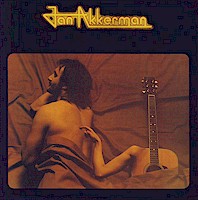 |
Grade: * star Artist: Jan Akkerman Title: Jan Akkerman LP Art Direction: Hans Tonino and Rens Benerink LP Designer: Rens Benerink Company: Atlantic Catalog: SD 19159 Year: 1977 Country/State: Amsterdam, Holland
|
Because I liked the single 'Crackers', "Jan Akkerman" was one of the first albums I bought when my family moved to Belgium. I can't say the rest of the album was anywhere near as good. Anyhow the album's on this list because Rens Benerink's cover art has disturbed me from day one ... There's just something very disconcerting seeing him sharing his bed with an acoustic guitar with a female arm caressing Akkerman's back. = ) |
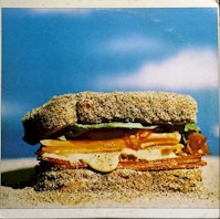 |
Grade: * star Artist: Sand Title: Sand LP Art Direction: Vicki Hodgetts LP Designer: Vicki Hodgetts Company: Barnaby Catalog: BTR 10006 Year: 1973 Country/State: Portland, Oregon
|
1973's "Sand" offers up an unknown,
but enjoyable slice of country-rock. The hideous album cover
certainly didn't do the band any favors. Woo thought covering a
sandwich in sand was a good idea? The marketing concept got even
better when their label Barnaby Records decided it would be a great
marketing campaign to ship out promotional copies of the LP covered with
sand that had been glued to the cover with Elmers.
Last time I thought about it the mixture of sand and vinyl just didn't work very well. |
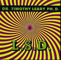 |
Grade: **** stars Artist: Dr. Timothy Leary Title: L.S.D. LP Art Direction: unknown LP Designer: unknown Company: PIxie Catalog: CA 1069 Year: 1966 Country/State: unknown
|
Ah, the Guru of '60s counter culture ... Well, his album is a snore fest that hasn't aged well. In fact the only redeeming feature on this album came in the form of the timepiece cover art. No credits on the album, but it is a doozy to look at and contemplate. = ) |
 |
Grade: **** stars Artist: The Rascals Title: See LP Art Direction: unknown LP Designer: Rene Magritte Company: Atlantic Catalog: SD-8246 Year: 1969 Country/State: Belgium
|
I've always been a fan of Belgian surrealist
artist René Magritte which explains why this one appeals to me. I
have no idea how Atlantic Records and the Rascals managed to get rights to
use a picture of Magritte's La Grande Famille (The Large Family) for the
cover, but it is cool.
I've also wondered why The Racals chose the imagine since there's no apparent connection to the title - no images of a family, or even a human. Perhaps the bird was meant to symbolize peace and love?
|
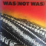 |
Grade: **** stars Artist: Was (Not Was) Title: Was (Not Was) LP Art Direction: unknown LP Designer: David Heffernan, Marverse Players and Terry Roebson (airbrush) Company: Ze/Island Catalog: Year: 1981 Country/State: Detroit, Michigan
|
I've looked up the names, but never found any information on Marverse Players, or airbrush artist Terry Roebson. Shame since their work on the first Was (Not Was) album just screams early-'80s at me. Great colors and interesting "Levittown" concept. From a musical standpoint the album's equally interesting.l |
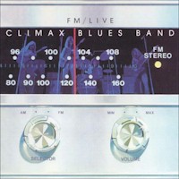 |
Grade: **** stars Artist: Climax Blues Band Title: FM/Live LP Art Direction: unknown LP Designer: David Heffernan Company: Sire Catalog: SAS-7411 Year: 1974 Country/State: Stafford, UK
|
My affection for David Heffernan's cover must have something to do with the fact I'm a child of the '70s. My high school and college years were largely defined by the size of your stereo system. MY goodness, I can remember friends who had speakers the size of small minivans - amplifiers that could power those monsters ... bigger and more powerful was better. LOL. Today you can get more power and superior sound quality from something the size of a PopTart. Oh well. The memories are priceless.
As for Heffernan, I didn't realize it, but in addition to working as a film director and in-demand artist, he's responsible for dozens of rock album covers; perhaps the best known (if not the best) being Led Zeppelin's "Physical Graffitti."
|
 |
Grade: **** stars Artist: Billy Lawrie Title: Ship Imagination LP Art Direction: unknown LP Designer: Rosie Coole Company: RCA Catalog: SF 8395 Year: 1973 Country/State: Scotland
|
I'd love to know
something about the designed. I've looked her up on the net and the
only reference I've found is she was the designed for The Sparks' 1976
album "2 Originals of Sparks."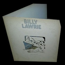
Her cover for Billy Lawrie's solo album is pretty awesome. A die-cut, gimmick sleeve it's hard to believe that RCA marketing would have agreed to such an expensive outlay for an unknown singer like Lawrie. Sure he was Lulu's young brother, but they were still picking up the tab. The two dimensional photo really doesn't do the cover justice, so here's another image which kind of shows the die-cut properties:
|
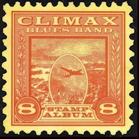 |
Grade: **** stars Artist: Climax Blues Band Title: FM/Live LP
Art Direction: Company: Sire Catalog: SAS-7411 Year: 1974 Country/State: Stafford, UK
|
At least for a
brief period of time, II think most boys collect stamps. I was
guilty of the pass time. Perhaps that explains my affection for the James
Flournoy Holmes cover art gracing 1974's "The Stamp Album."
Born and raised in Spartanburg, South Carolina, Holmes is another artist/photographer who's developed a sideline designing covers for dozens of albums. His catalog stretches back to the early 1970s and includes classic covers such as The Allman Brothers' "Eat a Peach" (ever see one of the Allman Brothers' "mushroom" pictures? Blame Holmes), Dr. John's "In the Right Place", and The Brains' "Dancing Under Streetlights." Along with his brother David Powell he founded the graphics studio Wonder Graphics. For anyone interested, he has an interesting website at: FLOURNOY HOLMES
|
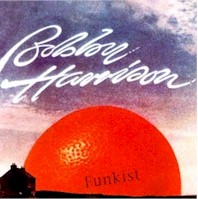 |
Grade: **** stars Artist: Bobby Harrison Title: Funkist LP Art Direction: unknown LP Designer: Cream Company: Capitol Catalog: ST-11415 Year: 1975 Country/State: US
|
Yes, naming his
first solo LP "Funkist' was cute and funny. That said, Bobby
Harrison was lucky Sunkist didn't come after his ass for copyright
encroachment. Of course the Sunkist legal team was probably thinking
"this guy" doesn't have squat in the way of assets, so what's
the point?"
Anyhow, I have no idea who was responsible for the cover since the liner notes simply reflect "sleeve design produced by Cream". Regardless it was cute and momentarily eye catching.
|
 |
Grade: **** stars Artist: The Doobie Brothers Title: Best of the Doobies LP Art Direction: Bruce Steinberg LP Designer: Bruce Steinberg Company: Warner Brothers Catalog: BSK 2879 Year: 1978 Country/State: US
|
Being
a big Doobie Brothers fan and also having a fascination with neon and
jukeboxes, this cover had it all.
The last Bruce Steinberg (he died in December 2007), was an interesting guy. He started his career as a NASA engineer, but also found time to learn the harmonica (playing on a host of albums including LPs released by It's a Beautiful Day and Tower of Power. He's also credited with a long list of album covers. There's a nice website dedicated to Steinberg's career at: BRUCE STEINBERG GALLERY - Classic Images of Tower of Power and the Bay Area Music Scene
|
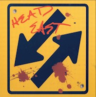 |
Grade: **** stars Band: Head East Artist: Head East LP Art Direction: Roland Young LP Designer: Michael Fink, Rod Dyerlns Company: A&M Catalog: SP-4860 Year: 1978 Country/State: US
|
If nothing else,
the cover's vivid colors and embossed pressing were eye-grabbing when
released. I clearly remember gravitating to it when I first saw it
in a Norther Virginia Penguin Feather store.
Starting in the mid-'70s, designer Fink has worked on dozens of album covers over the years (seemingly focusing on retrospective and compilation sets). He owns and operates ilevel and has a website at: Mike Fink - about (myportfolio.com)
|
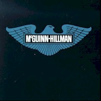 |
Grade: * star Artist:: McGuinn - Hillman Title: McGuinn - Hillman LP Art Direction: Roy Konara LP Designer: Peter Shea Company: Capitol Catalog: SO-12108 Year: 1981 Country/State: US
|
We've all heard the
old saying you can't judge a book by it's cover. Well, here's an
example where you can judge an album by it's cover. This cover looks
like it was developed in about thirty minutes. I'm guessing the bird
emblem was a subtle nod to Roger McGuinn and Chris Hillman's musical roots
with The Byrds. If so, that was about as close this collection got
to those roots.
I wonder how much Capitol Records shelled out for this concept? |
 |
Rating: **** 4 stars Artist: Ruth White Title: Short Circuits: Electronic Realizations and Performances LP Album Direction: Roland Young LP Designer: unknown Company: Angel Catalog:
S 36042 Country/State: Pittsburgh, Pennsylvania
|
There's just something about Roland Young's cover design that screams early-1970s at me. His design for 1970's "Short Circuits: Electronic Realizations and Performances" is colorful; slightly psychedelic and a perfect fit for Ruth White's album of electronic/classic music. It's just so different from the standard "glamour shot" found on so many early-'70s albums.
Young has enjoyed a lengthy career in design. He started as an apprentice of designer Louis Danzinger and in 1964 joined Capitol Records as a photographer and designer, working on album advertising and packaging concepts. His work was featured on dozens of the label's albums including The Standell's "Dirty Water", Peter and Gordon's "Lady Godiva", and Peggy Lee's "Bridge Over Troubled Water." In 1970 he switched over to A&M Records where he continued to produce album covers and became involved in leading the company's advertising campaigns, working with hundreds of acts as ranging from Cat Stevens, to Cheech and Chong and Carole King.
He owns his own design company (Roland Young Designs) and has served as a Professor at Pasadena's Art Center College of Design
|
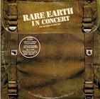 |
Rating: **** 4 stars Artist: Rare Earth Title: Rare Earth Live In Concert LP Album Direction: Curtis McNair LP Designer: Curtis McNair Company: Rare Earth Catalog:
R 534D Country/State: Pittsburgh, Pennsylvania
|
Yes, yes, yes ... I
am a sucker for gimmick album covers and while this double LP in-concert
set may not be the most exciting live album in my collection, I've always
loved the late Curtis McNair's packaging. Sadly McNair seems little
known to the rank and file, though he was responsible for roughly 100
Motown album covers (including Marvin Gaye's "What's Going On".)
Sadly McNair passed on in July 2017. Here's a link to his obituary: Obituary for MR. CURTIS GASTON MCNAIR (localonlineobituaries.com)
|
 |
Rating: **** 4 stars Artist: Traffic Title: Traffic On the Road LP Album Direction: Ann Borthwick LP Designer: Ann Borthwick Company: Island Catalog:
ISLA 2 Country/State: unknown
|
I
knew who Traffic were when I bought this album, but have to admit it was
one of the first albums I ever bought more for the packaging than the
music. Not that "On
the Road"
was bad - nah, just kind of long, plodding, and mid-'70s self-indulgent
... On the other hand, Ann Borthwick's cover art was very cool in a
detached, almost clinical fashion. 
And Borthwick's a complete mystery to me - I've wasted a lot of time trying to locate some information on the artist. The only thing I've stumbled across is she also designed the album cover for a 1973 collection by the British jazz outfit Spontaneous Music Ensemble – "For You To Share." Someone out there must has some insight into the woman ...
|
 Rather
than regurgitate the material, I'm going to include a link to an
interesting 2009 interview McNair did with the EFM Radio blog:
Rather
than regurgitate the material, I'm going to include a link to an
interesting 2009 interview McNair did with the EFM Radio blog: