|
Obviously my life is rather boring and sedimentary, but as part of my love of old fashioned "vinyl", I've always been fascinated by "gimmick" album covers, There are millions of album covers out there, but given record lavels are by nature "cheap" enterprises, relatively few "gimmick" covers exist. After all why would a record label want to spend money on a band that was liable to lose money? Covers that go beyond the standard "flat" cover merit further investigation.
Separately I've got a list of covers whose artistic merit, of lack of merit (or lack thereof) that have attracted my attention: LP COVERS THAT CAUGHT MY ATTENTION
As always, additions and comments are welcome.
Scott
|
|
The Wailers "Catch a Fire" (Island catalog number SW-9329)
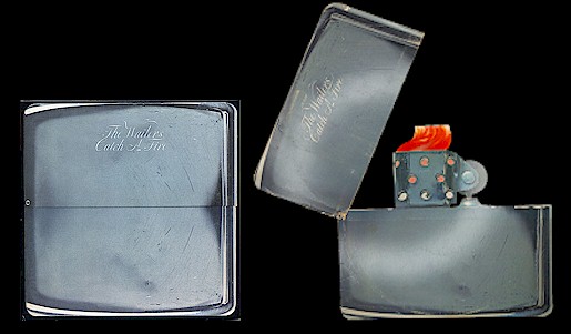
When I started selling used albums letting go of an original copy of The Wailers' "Catch a Fire" was one of the biggest mistakes I made. It wasn't that I didn't like the album, or I didn't find the "Zippo lighter" cover captivating. Frankly getting $80 for the seemed like a fortune at the time. Dumb, dumb, dumb ...
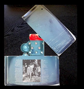
Released in 1973, "Catch a Fire" was The Wailers fifth studio album and marked their sophomore collection for Chris Blackwell's Island Records. Island seemingly thought this would be the band's break thru release, spending substantial amounts on the album packaging. Designed by South African born Rod Dyer and Bob Weiner the album featured a hinged Zippo lighter with The Wailer's name and the album title engraved on the top portion of the lighter. With a small rivet, the cover opened up to reveal the inner sleeve. Island Records marketing and art director Tim Clark described the package: "The top half was riveted to the bottom half, which was a receptacle for the record and its inner bag, so the thing literally opened as a Zippo lighter would." Dyer had been designing album covers for Capital Records and other labels since the early 1960s; most of his covers fairly bland. Certainly not the case here.
Dyer is apparently still active. I found a link to a website that highlights his work, though there is no biographical or contact information: - Rod Dyer Design
Bob Weiner is a complete mystery to me.
Because the rivets had to be hand installed and the two piece cover had to be hand adjusted to insure the would properly aligned when opened and shut, it was time consuming and expensive to manufacture the cover. That makes it easy to understand why Island only pressed about 20,000 copies.
Taken by Jamaican photographer Cookie Kinkead, the flip side of the cover featured a photo of The Wailers, liner notes and the track listing.
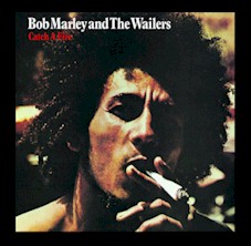
As you'd expect, the gatefold cover was expensive to produce so when it came time to reissue the album Island Records opted to credit it to "Bob Marley and the Wailers" and to go with a standard cover. The reissue featured a painting of a young Bob Marley holding a big spliff by Jamaican artist Esther Anderson. You have to laugh about it but after the reissue LP was released Jamaican police raided Anderson's studio and confiscated the original painting and related photos she had taken. All I can say is the original cover was so much cooler.
ADDED: AUGUST 01, 2026
|
|
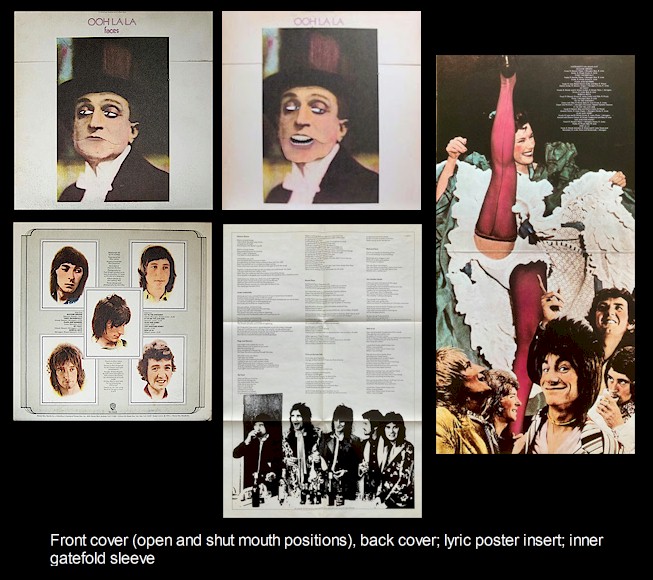
The Faces "Ohh La La" (Warner Brothers catalog number BS 2665) Showing my age here, but I had a high school girlfriend who was a big Rod Stewart fan and introduced me to The Faces "Ohh La La" album ... I'd heard Rod Stewart, but The Faces were an unknown quantity to me. Mind you, I love this album (see my comments at: http://badcatrecords.com/BadCat/FACES.htm), but the real treasure was James (Jim) Ladwig's album cover.
As the one of the partners in the Chicago-based Album Graphics Incorporated, Ladwig had a lifelong interest in advertising memorabilia and paper collectibles. His collection included a 1930s era ad that featured movie star/dancer Fred Allen shilling for toothpaste. The ad included a tab that could be pulled to move Allen's eyes and mouth. Inspired by the ad, Ladwig designed a draft album cover featuring Rod Stewart and Ronnie Wood's heads with a similar gimmick. The pair were impressed with Wood reportedly uttering the famed phrase "Ohh La La" which went on to be use as the title for their final studio album. Instead of using Stewart and Wood on the cover, the decision was made to use the Italian character Gastone. When you pressed down on the top of the album the character's eyes and mouth moved. Admittedly it could be kind of strange to see. The inner sleeve featured a photo of the band ogling a can-can dancer who was in mid-kick. Original copies of the album featured an over-sized bonus poster. Given his accomplishments which included six Grammy nominations for his album packages (he one once for The Ohio Players 1975 "Honey" album), Ladwig passed on with little notice. 80 at the time of his death, he died of cancer in April 2014.
ADDED: JULY 30, 2026
|
|
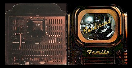
Family "Bandstand" (United Artists catalog number UAS 5644)
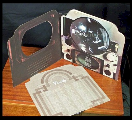
For a band that hadn't generated a great deal of profit for the record label, United Artists clearly put some money into the packaging for Family's 1972 album "Bandstand". With the album concept and design credited to John Kosh and photographer Peter Howe, the gimmick cover included a gatefold sleeve with a die cut panel for the television "screen" and beveled top corners.
hat description doesn't provide a great explanation of the cool concept, so here's Here's a picture of the total package, including the LP's custom insert sleeve.
ADDED: JULY 14 2026
|
|
Rolling Stones "Sticky Fingers" (Rolling Stone catalog number COC 59100)
Beyond any doubt, The Rolling Stones' "Stick Fingers" is one of rock's most famous covers ...
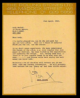
Andy Warhol is credited with having come up with the original concept for using a zipper on an album cover. He apparently broached the idea to Mick Jagger at a 1969 party they were attending. With the Stones having recently signed to Atlantic Records where they were given their own Rolling Stones Records imprint giving them access to a large recording and promotional budget, Jagger was interested in the idea and later in the year sent Warhol a letter telling him to go ahead with the project.
Warhol delegated the resulting design job to Craig Braun who initially suggested the album be released in a clear plastic jacket with heat sensitive crystals inside, or wrapped in rolling paper. A foldout cover of Jagger's French chateau was also suggested. Aware of the difficulties associated with any kind of complex package, Jagger rejected those alternatives, deciding to stick with Warhol's original zipper concept. You can see a copy of Jagger's letter to Warhol at the left.
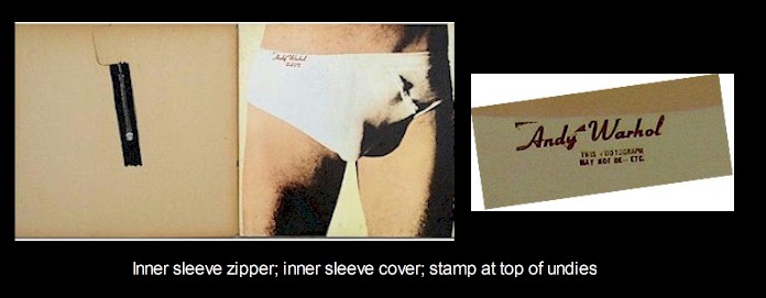
Interestingly, beyond the original concept, Warhol's direct participation seems to have been limited to providing Braun with the concept for the project and a Polaroid photo showing the general idea. Warhol apparently provided the second photo of a model in undies that was used for the album's inner sleeve. Braun and his design team were left to do the rest.
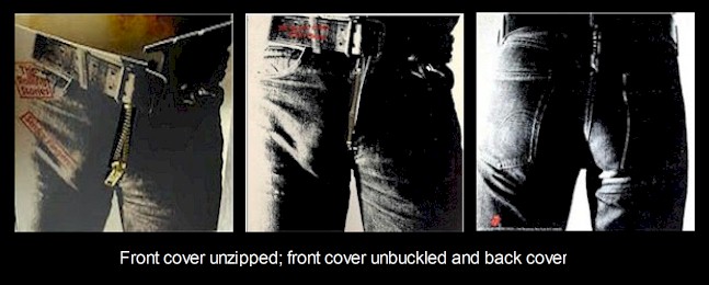
Abandoning their more experimental ideas, the final version of the cover featured a close up of a well endowed, blue jeans-clad male crotch. The cover featured a working zipper and a belt buckle that opened to reveal a model in cotton briefs. Photographer Billy Name was credited with the cover photo and contrary to popular rumor, the model was not Jagger. The actual model has been subject to much debate. A series of photos were taken and provided to Warhol who picked one without documenting the "owner". Not that it matters, but the most likely candidates seem to have been Factory hanger-on/adult film star Joe Dallesandro (who has been quoted as saying it was him), Jay Johnson, or artist/designer Corey Tippin.
When the mock-up sleeve was complete designer Braun realized curious buyers were going to want to know what was behind the zipper. He was also concerned the zipper insert would damage the record grooves. As a result a third panel was added beneath the outer cover. Warhol was responsible for the resulting picture of anonymous male model posing in jockey shorts.
When the album hit stores Atlantic was initially faced with some retailers refusing to stock it out of concern the tight jeans would be offensive. It doesn't take a lot of imagination to see the model's god given gifts on the album cover. Luckily the album quickly began generating sales and in the face of potential profits to be mad boycott concerns quickly faded away.
That was not the end of the album's marketing nightmare. In spite of the additional inner sleeve, during shipment the zipper invariably pressed into the vinyl damaging the 'Sister Morphine' track. Face with thousands of returned albums Atlantic Records threated to sue designer Braun. The ingenious solution was to pack and ship the album with the zipper pulled halfway down.
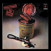
In Spain (still under the rule of General Francisco Franco), the cover was deemed offensive and replaced with alternative artwork designed by Warhol collaborators John Pache and Phil Jude. Wildly known as the "can of fingers" cover, you have to wonder why the alternative cover was deemed less offensive than the original.
In conjunction with a re-release of "Sticky Fingers" I came across a fascinating New York Times interview with Craig Braun. Here a link to the article: http://www.nytimes.com/2015/06/08/arts/music/art-of-the-rolling-stones-behind-that-zipper-and-that-tongue.html?_r=0
ADDED: JULY 04 2026
|
|
Ambrosia "Somewhere I've Never Travelled" (Twentieth Century Fox catalog number T-510)
As a freshmen in college I had a roommate who was quite adventuresome when it came to music - well,certainly more out there than my top-40 tastes. One of the bands he really liked was Ambrosia and he had a copy of their sophomore release "Somewhere I've Never Travelled". I can remember him playing the LP time after time and reaching a point where I was about ready to throw it out the window. There was just something about the LP's weird blend of pop and progressive motifs that irritated me no end - kind of like the roommate did at times. 'Course I'm sure I was an even bigger irritation.
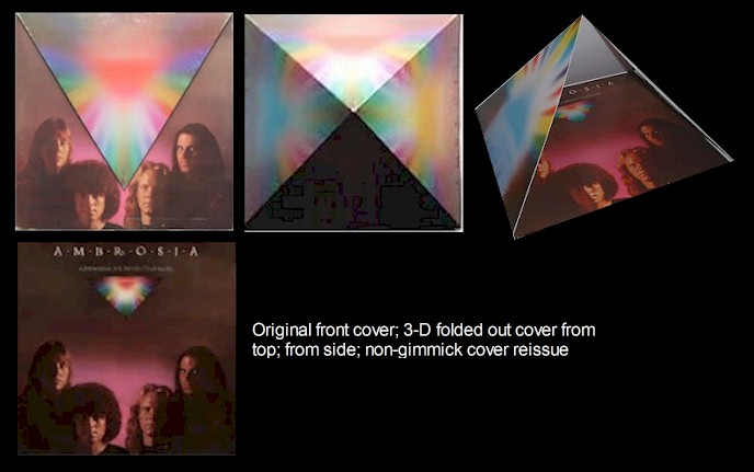
As much as I disliked the album at the time, the David Larkham designed album cover was quite cool. 20th Century Fox spent some big money on the packaging which unfolded into a pyramid (I'm not quite sure why, but pyramids were very cool in the mid-'70s). The packaging was quickly abandoned with subsequent released featuring a standard flat cover.
Anyhow, I just wanted to apologize to Rob for being a dick of a roommate and thanks for introducing me to Ambrosia and all the other cool music ... Hope life has been kind to you through all the years.
Postscript: I actually tracked down my old roommate. We exchanged a couple of texts and boom - he vanished into thin air. No responses to my follow-on messages. Only conclusions I can draw are I was a bigger douchbag than I thought, or Rob has passed on. Hopefully not the latter,
ADDED: NOVEMBER 20, 2025
|
|
Jefferson Airplane "Long John SIlver" (Grunt catalog number FTR 1007)
It is somewhat amusing that this would be the first gimmick cover I blog about. I'm about as straight laced as you get and the thought of owning a stash box is totally foreign to me. That said, there's just something so '70s about this album cover ... It was certainly the perfect album cover for The Jefferson Airplane who were literally drawing their final creative gasps.
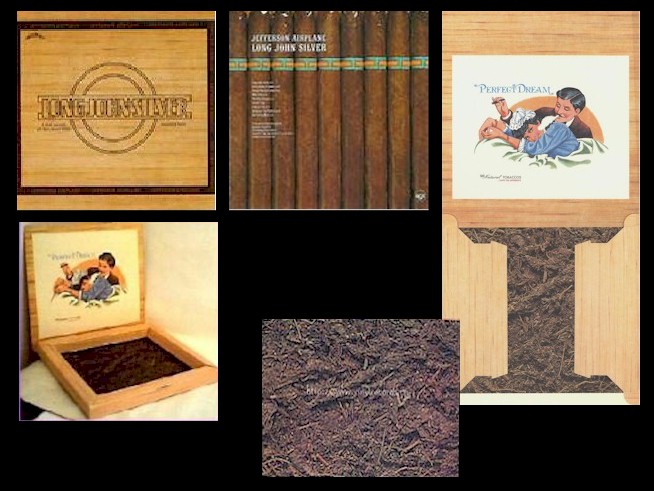
Designed by Pacific Eye & Ear, the original 1972 "Long John Silver" album sleeve folded up into a replica of a cigar box - well it looked like cigar box. The inner record sleeve bore an image of cigars while the inside bottom of the box was covered with a photo of what suspiciously looked like marijuana. (The band was even generous enough to credit Borris for the weed.) It wasn't a particular sturdy artifact, but if you followed the instructions printed on the inner sleeve, you actually did end up with a stash box and folks apparently did use the cover for storing medical goods.
ADDED: NOVEMBER 02, 2025
|
|
Jethro Tull "Stand Up" (Grunt catalog number FTR 1007)
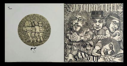
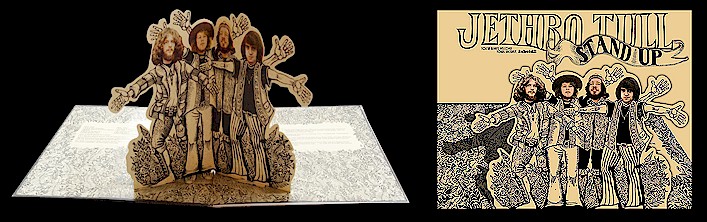
Perhaps the first "gimmick" cover album I ever purchased. In fact I didn't even realize it was a gimmick cover until I got home and was delighted when I opened the gatefold sleeve and a cardboard cut out of the four band members sprung up (Ian Anderson, Glenn Cornick, Clive Bunker, and Martin Barre).
The album concept originated while the band was touring the US in support of their 1968 debut album "This Was". Thinking about marketing their forthcoming sophomore album, producer Terry Ellis had the idea of hiring Connecticut-based artist James Grashow to do a wood carving of the band. Grashaw spent a week with the group which resulted in the cover for 1969's "Stand Up". The idea for the "pop up" feature came from Ellis and album art director John Williams who saw it as a funny way to tie back to the album title. As part of an interview with ArtOnline (see link below), Grashaw talked about the Jethro Tull project: "I was doing a lot of woodcuts in my early college days, and there was a woman in my class who knew someone from Chrysalis Records. She thought that I would be perfect to do the album cover and she made that connection. They called me up and told me there was this new band called Jethro Tull, and asked me if I was interested. It is funny, I did that piece about 40 years ago and I received an email last week from a man in Switzerland asking me why Ian Anderson has eleven fingers on that album cover. It was a mistake."
Given pressing costs, starting with the 1972 reissue, the pop feature was dropped, but it was reinstated as part of Steve Wilson's 2017 remix package.
Postscript: 83 years old, Grashaw passed away in September, 2025. While reading up on Grashaw's extensive career, I found an interesting May 2010 online interview the Artinterview website conducted with Grashaw: ART Interview - ONLINE Magazine
ADDED: OCTOBER 30, 2025
|
|
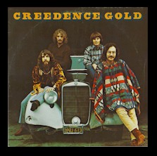
Creedence Clearwater Revival "Creedence Gold (Fantasy catalog number F 9418)
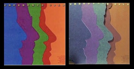
If you've never explored the Creedence Clearwater Revival catalog (shame on you), then this 1972 compilation is a great place to start. It's certainly not all-inclusive, but every one of the eight tracks is a classic. Plus you get Brian Gardner's cool, multi-layered album cover.
The original vinyl release featured pictures of the band under the colored profile flaps on the cover. I looked around for a good photo that would show how cool the Tony Lane designed gimmick cover was, but couldn't find one that really showed it off. Best I could find was the photo to the left which sort of displays the cover's unique four profile flap design. If you can't make it out, the cover features cutout silhouettes of the four band members under colored profile flaps. The blue flap was Doug Clifford, the purple was Stu Clifford, green was Tom Fogerty and red was John Fogerty. The flip sides of the flaps had photos of the band members and listed their inames and primary nstrument. Anyhow, the clever (and costly) cover certainly wasn't something you would have ever expected from a label like Fantasy.
Given the cost of the gimmick sleeve, it shouldn't have come as a surprise that overseas releases switched the cover art, with the band photo on the front, and the colored silhouettes on the back.
OCTOBER 25, 2025
|
|
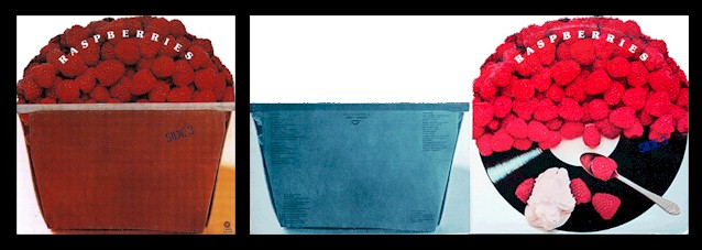
The Raspberries "Side 3" (Capitol catalog number SMAS 11220)
There are lots of die-cut album covers, but The Raspberries "Side 3" is unique given some copies included a raspberries scented scratch and sniff sticker.
Rod Dyer was responsible for the gatefold, die-cut jacket. Luckily looking at the photos will explain the elaborate jacket far better than my clumsy description.
(PHOTO 1) The album cover displayed a bowl stacked with fresh raspberries. The band's name was printed along the top, while the album title is found on the bowl. (PHOTO 2) The bowl portion of the sleeve folded out revealing the track listing and performance credits. It also revealed a photo of the raspberries sitting on top of a vinyl album, compete with a spoon and what looked like whipped cream.
(PHOTO 3) The back panel was similar to the front cover, but without the band name, or album title.
By the way, it's a great power-pop collection with some of their best performances - "Tonight", "Ecstasy", "On the Beach" and Dave Smalley's "Hard to Get Over a Heartbreak".
ADDED: OCTOBER 12, 2025
|
BACK TO BADCAT PAYMENT INFORMATION